
Research | Usability Testing | UX Design
Website Redesign
Client: Museo de las Americas (Student project at The University of California, San Diego)
My role: Research and UX design
Duration: 2 months
Overview
Museo de las Americas is the premier Latin American art museum in the Rocky Mountain region. It is dedicated to educate the community through collecting, preserving, interpreting and exhibiting the diverse arts and cultures of the Americas from ancient to contemporary, through innovative exhibitions and programs.
Museo de las Americas has served the Denver community for 28 years through award-winning exhibitions, education programming, and special events.
Objective
Per the Web Content Accessibility Guidelines (WCAG), anyone who wants to use the web must have content that is: perceivable, operable, and understandable. Currently, all of those aspects are compromised in museo.org.
In addition, since this is a non-profit organization, more emphasis should be placed on membership, donations and sponsorships.
Navigation changes, a defined hierarchy and community reach options need to be implemented in order to create a better user experience and engagement.
User Personas


User Stories
I am: An educator and I am always looking for workshops and field trips that can expand my students’ knowledge.
My frustration is: Not finding enough information online about scheduling workshops and/or exhibit tours.
Therefore, I need: A website that can provide all the information I need about workshops, exhibits and scheduling group tours.
I am: A local who enjoys visiting museums and sharing events information with my friends.
My frustration is: Missing cultural events or exhibits. Not being able to share upcoming happenings via social media.
Therefore, I need: More information in the website regarding current exhibits and a way to follow the museum through various social media channels.
I am: A local artist who has been part of the Latino community for decades.
My frustration is: This museum needs to be well-known in the Latino community. Not enough people knows about it.
Therefore, I need: A reinforced digital presence to promote the positive cultural and academic impacts that the museum has in the city.
Challenge 1: Not Perceivable
Some text on the site is not legible:

White text headline with drop shadow.
Very light gray text displayed next to one of the main hero images in the homepage.

Readability is compromised due to font size.

Yellow text displayed on top navigation with similar background color.
Yellow font on a white background for dropdown.
Impact of Current Perceivability Issues
Small fonts create a readability issue, even more so for those with vision problems. Findings from the 2017 National Health Interview Survey (NHIS) data release established that an estimated 26.9 million adult Americans (or about 10% of all adult Americans) reported they "have trouble" seeing.
Insufficient contrast between the text color and the background degrades the user experience because eye strain can take place when trying to decipher the words.
Research has also shown that people are less trusting of text that is hard to read — a carryover from the age of fine print.
The Web Content Accessibility Guidelines WCAG 2.03 requires that the foreground and background colors have a 4.5:1 contrast ratio at Level AA and a 7:1 contrast ratio at Level AAA. The yellow font on a white background used in the dropdown navigation does not meet these requirements:

Dropdown navigation color (#FDB813) failed contrast check.
Usability Test
A usability test was performed in order to determine the readability of the active state on the top navigation.

Five people (Ages 19 to 74) were asked to perform a specific task: to read the active top navigation state after scanning the content inside that page.
The findings are as follows:
The task times varied between 3 seconds and 5 seconds.
Non of the users was able to read the text within one second.
Five out of five users said the active navigation state was hard to read.
The 74 year old user reported eye strain when trying to discern the text from the background.
Cognitive strain increases when text is not legible. When users perceive false affordances, or miscues, they take longer to determine the correct interpretation.
Solutions to Current Perceivability Issues
Change small font to 16pt. MIT study on Typographic Style Legibility in Reading at a Glance confirmed that text size contributes to faster reading and greater comprehension when users only glance at content.
Create contrast. Use dark gray body font on the white background.
Change Navigation. Implement dark gray on white for dropdown navigation. Eliminate yellow as a background color for the navigation and its white font.
Challenge 2: Operability
Current Issues:

“Collections > Explore the collection” is an empty page.

“Education > Cultural Art Workshops > Register by clicking here” goes to a “Not Found” page.
“Exhibitions > Past Exhibitions” takes seven seconds to load and most pages take four seconds to load which may disorient users.
Impact of Current Operability Issues
A poor experience has a very negative aspect on the museum’s reputation and credibility. It is estimated that 74% of users who encounter an empty page or a 404 page immediately leave the site.

The ripple effect of a poor 404 experience
(Springtrax)
Slow page loading speed generates user frustration. Jakob Nielsen, renown web usability consultant, defined the 3 response-time limits which are determined by human perceptual abilities:
0.1 seconds. This level of responsiveness is essential to support the feeling of direct manipulation. It’s also an ideal response time for the website.
1 second. One second keeps the user’s flow almost seamless. While users notice a slight delay, they still feel in control of the experience.
10 seconds is the limit for the user’s attention. A 10-second delay in the web without any feedback will often make visitors leave a site immediately.
The response-time limit has continued to fall in recent years. Even though the 10 seconds is the limit for the user’s attention, in many cases, visitors will leave your website if it won’t load in a few seconds.
Solution to Current Operability Issues
Design a customized 404 error/not found page
One of Jakob Nielsen’s 10 heuristic principles for user interface design is ‘Help users recognize, diagnose, and recover from errors.’
The error page needs to include:
- Apologetic statement that the requested URL/page could not be found on the site
- Easy to understand explanation for non-technical users
- Suggesting steps the user can take to correct the problem
Challenge 3: Functionality
Current Issues
The navigation is not consistent. “About Us > History” includes a side navigation that could be confusing since breadcrumbs are not used.

The lack of an organized hierarchy creates a frustrating user experience with considerable cognitive load.
Impact of Current Functionality Issues
Clicking on the navigation item that takes the user to a subpage with an entirely new navigation system without breadcrumbs could cause some unwanted user anxiety and page abandonment.
The unorganized information architecture gives the website an inconsistent structure, increases cognitive overload, and makes it harder for the user to navigate different parts of the site.
Solutions to Current Functionality Issues
Organized information architecture:

Website Redesign with the following features:
Hero banner in the homepage to highlight exhibits and events
Images, description and link to ongoing exhibits shown in the homepage
“Join and Support” section in the homepage to emphasize benefits of membership
About page that include the General Manager’s statement to the community
“Our values” included in the about page to solidify the museum’s role in the community
Museum team photos in the about page to create a connection with visitors
Organized academic events and workshops features in the education page
Included “Our Team at work” video in the education page to show the educators’ impact
Student testimonials added to the education page to support the museum’s mission
Current, upcoming and past exhibitions categories included in the exhibitions page
Current, upcoming and past events categories included in the events page
Members testimonials added to the join & support page to create engagement
Included donate button to the join & support page
Get our newsletter page to stay connected to the community
Search option more visible

Homepage Wireframe - Emphasis on membership

About Page Wireframe - Emphasis on values
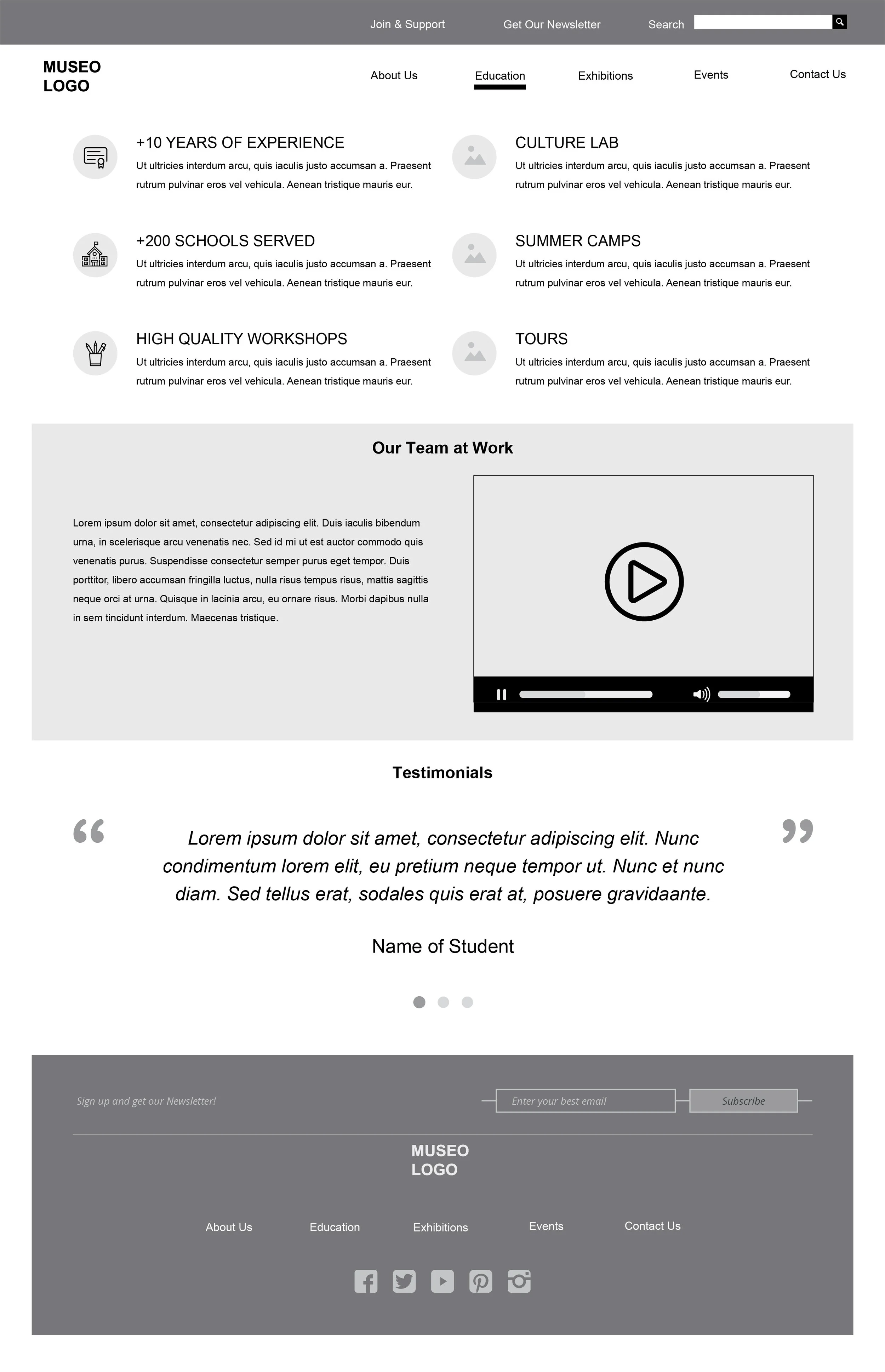
Education Page Wireframe - Emphasis on impact in the community

Exhibitions Page Wireframe - Emphasis on tickets availability

Events Page Wireframe - Emphasis on tickets availability

Contact Page Wireframe - Emphasis on hours and affordability

Join & Support Page Wireframe - Emphasis on membership benefits

Newsletter Page Wireframe - Emphasis on connecting with the community

Homepage Design

About Page Design

Education Page Design

Exhibitions Page Design

Events Page Design

Contact Page Design

Join & Support Page Design

Newsletter Page Design